Accessible UI component implementations across React, Astro, Svelte, Vue, and Astro following WAI-ARIA APG patterns
Overview
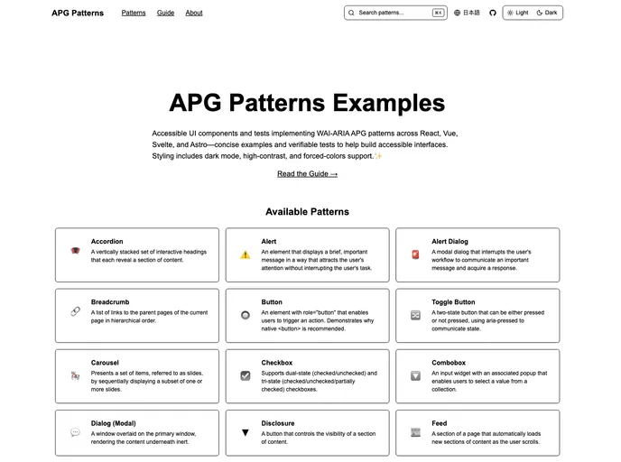
The APG Patterns Examples project serves as a comprehensive resource for developers looking to implement accessible UI components following the WAI-ARIA Authoring Practices Guide (APG) patterns. With implementations across major frontend frameworks such as React, Vue, Svelte, and Astro, this project not only facilitates learning about accessibility but also ensures that your components adhere to industry standards.
Each component is complemented by test cases that verify compliance with APG patterns, allowing developers to directly validate the accessibility of their own applications. The emphasis on dark mode, high contrast mode, and forced colors mode highlights the project’s dedication to inclusivity, ensuring that all users can access digital content with ease.
Features
- Cross-Framework Compatibility: Offers implementations across React, Vue, Svelte, and Astro, making it easy to integrate accessible components into any project.
- WAI-ARIA Compliance Testing: Built-in tests to verify that each component meets WAI-ARIA APG standards, ensuring that your UI is accessible from the ground up.
- AI-Friendly Documentation: Documentation formatted to be easily interpreted by AI tools, simplifying the process of generating additional test cases.
- Theming Support: Includes styling options that cater to dark mode, high contrast mode, and forced colors mode, enhancing accessibility for users with different visual needs.
- Comprehensive Component Library: A wide range of fully implemented components like Accordions, Alerts, Carousels, and more, all compliant with APG patterns.
- Completion Status Tracking: Easily see which components are complete and which are planned for future implementation, helping manage project timelines effectively.
- User-Friendly Design: Each component is designed with usability in mind, making them straightforward to use and integrate into existing applications.
- Robust Community Support: As an open-source project, users can contribute to improvements and add new components, fostering a collaborative environment for accessibility innovation.