A lightweight, zero-dependency responsive layoutgrid overlay component for AstroJS
Astro LayoutGrid is a lightweight and efficient responsive grid overlay component designed specifically for developers who wish to align their content with precision. With a focus on visual accuracy, it proves invaluable for implementing design systems and ensuring consistency across various screen sizes. The component is especially suited for responsive development, catering to mobile, tablet, and desktop users seamlessly.
One of the standout aspects of Astro LayoutGrid is its zero-dependency nature, making it an ideal choice for developers who seek a fast and streamlined solution. The component not only enhances layout precision but also provides a user-friendly experience, allowing for real-time updates as the user adjusts their viewport.
Responsive Grid Overlay: Implements a visual grid system that adapts to mobile, tablet, and desktop breakpoints, ensuring consistent layouts across devices.
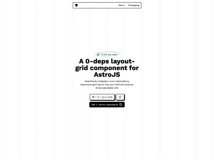
Keyboard Toggle: Quickly show or hide the grid overlay using Cmd/Ctrl + Shift + G, making it easy to use during the development process.
Highly Customizable: Offers extensive customization options, allowing developers to configure columns, spacing, colors, and breakpoints to fit their specific needs.
Real-time Responsive: Utilizes ResizeObserver for instant updates to the grid based on viewport changes, providing immediate feedback during development.
Visual Flexibility: Includes options for border-only or filled column displays, giving developers greater stylistic control over their layouts.
Zero Dependencies: Lightweight and fast, it ensures quick loading times and minimal impact on overall project size.
TypeScript Support: Features full type safety with comprehensive interfaces, enhancing the developer experience and reducing potential errors.
SSR Compatible: Fully compatible with Astro’s server-side rendering, making it versatile for projects using modern rendering techniques.